What To Know
- In this blog post, we’ll show you how to label X and Y axes in Excel, along with tips and tricks for formatting and editing your axis labels to enhance your Excel charts.
- Under the Axis Options tab, you can adjust settings like the interval of axis labels, change the angle of the label, or modify the axis type (linear or logarithmic).
How to Label X and Y Axis in Excel: A Step-by-Step Guide
When working with data in Excel, visualizing it effectively is key to conveying the story behind the numbers. One of the most common ways to represent data is through charts, and labeling the X and Y axes correctly is an essential part of this process. Proper axis labels help clarify the values represented and make your graph more readable. In this blog post, we’ll show you how to label X and Y axes in Excel, along with tips and tricks for formatting and editing your axis labels to enhance your Excel charts.
Why Are Axis Labels Important?
Before we dive into the step-by-step tutorial, it’s important to understand why axis titles matter. The X-axis (horizontal axis) and Y-axis (vertical axis) play a crucial role in providing context to the data points in your chart in Excel. By labeling these axes, you indicate what each axis represents, helping your audience quickly interpret the values in the graph. Whether you’re plotting positive numbers, categories, or time-series data, clear axis labels are essential for a meaningful graph.
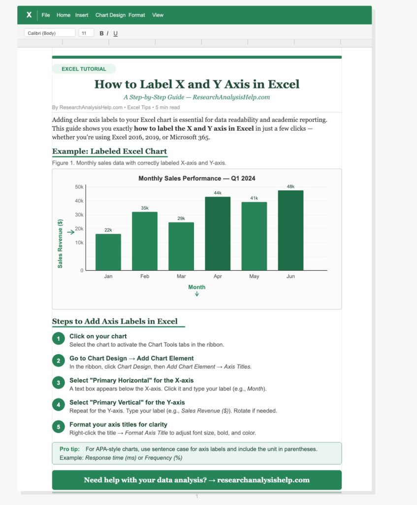
Step 1: Create Your Chart in Excel
To label the X and Y axes, you must first have a chart in Excel. Here’s how to create a chart using your data:
- Select the data you want to plot. For example, if you have two columns of data—one for categories (like months) and the other for values (like sales)—select these two columns.
- Go to the Insert tab in Microsoft Excel and choose the type of chart you want, such as a column chart, line chart, or scatter plot.
- Once you insert the chart, it will automatically display a blank area with a default X-axis and Y-axis, and you can then add axis labels to these axes.
Step 2: Add Axis Titles in Excel
Now that you have a chart, it’s time to add axis titles to help explain what the X-axis and Y-axis represent. Follow these simple steps:
- Click on the chart element that you want to label. This will bring up options for editing the chart.
- From the Chart Tools menu, click on the Layout tab.
- In the Labels group, click on Axis Titles. You’ll see options to add titles to both the primary horizontal axis (X-axis) and the primary vertical axis (Y-axis).
- Choose Primary Horizontal Axis Title to label the X-axis and Primary Vertical Axis Title to label the Y-axis.
Step 3: Edit Your Axis Titles
Now that you’ve added axis titles, you can edit them to reflect the appropriate data labels:
- Click on the axis title (you should see a text box appear).
- Type in the label that best describes the data on that axis. For example, if the X-axis represents months, you can label it “Month.” If the Y-axis represents sales figures, label it “Sales ($)”.
- After typing the title, click outside the box to apply it.
Step 4: Format the Axis Labels
Once you’ve labeled your axes, you may want to format them to make your chart more visually appealing and easier to read. Here’s how to do that:
- Right-click on the axis label (either on the X-axis or Y-axis).
- From the menu, choose Format Axis. This will bring up a panel on the right where you can adjust the axis values, change the font, or set tick marks along the axis.
- Under the Axis Options tab, you can adjust settings like the interval of axis labels, change the angle of the label, or modify the axis type (linear or logarithmic).
Step 5: Adjust Axis Values and Categories
In many cases, you may want to edit the range or categories on the X-axis or Y-axis. This is especially useful if you’re working with a column chart and need to adjust the axis values or categories to fit your data more precisely.
- For the X-axis (horizontal), you can adjust the axis values to ensure that the labels match the data points correctly. You can also format the axis to display categories if you’re plotting data that follows a specific category or time series.
- For the Y-axis (vertical), you can change the minimum and maximum values, or format the axis to display number values, such as dollars or percentages.
Step 6: Additional Tips for Labeling Axes
- Customizing Axes with Blank Area: Sometimes, you may want to add a blank area for a visual break or to adjust spacing between labels. You can do this by adjusting the spacing and tick marks in the Format Axis panel.
- Using a Dummy Series: In some cases, especially for complex data, you may want to create a dummy series to align the labels on the Y-axis or X-axis more effectively. This trick can help in achieving precise alignment for your chart.
- Use of Axis Label for Value Formatting: You can also use the axis label to format numbers. For instance, if you’re working with sales data, you can format the Y-axis label to display numbers as currency or percentages, depending on the data type.
Step 7: Final Formatting and Display
Once you’ve labeled your X-axis and Y-axis, and applied any formatting you need, take a moment to review your chart. Ensure that all labels are clear, the axis titles accurately describe the data, and the chart is easy to interpret. You can also highlight certain data points or categories by adjusting the format of the axis labels or values.
Additional Tips:
- Deleting Axis Labels: If you want to delete an axis label, simply click on it and press Delete or right-click and choose Remove.
- Stacking Data Labels: In certain chart types, you can stack data labels for better presentation. This is particularly useful in column charts or stacked bar charts.
- Custom Axis Labels: If you want a more customized axis label (for example, to display labels from a specific cell range), you can go to Chart Tools > Select Data and manually choose the range for your labels.
- Using PowerPoint: If you plan to include your Excel chart in a PowerPoint presentation, you can easily copy the chart from Excel and paste it into your slide. Then, edit the axis labels directly in PowerPoint if needed.
By following these steps, you can efficiently add axis labels, customize them, and create clear, informative graphs that help make your data easier to understand. Whether you’re working in Excel or preparing for a PowerPoint presentation, these tips will enhance your ability to present your data clearly and professionally.
Ready to Enhance Your Data Visualization Skills?
At ResearchAnalysisHelp.com, we offer expert guidance on creating professional Excel charts, including properly labeling X and Y axes, formatting your axis labels, and customizing your graphs for clear data representation.
Here are some related assignments that would benefit from understanding how to label X and Y axes in Excel, including the use of axis titles, chart elements, and data visualization techniques. These tasks can be applied in various academic, business, and research scenarios:
1. Data Visualization for Business Reports
Assignment Overview:
Create a report for your business analyzing quarterly sales data. Use Excel charts to present the data visually, ensuring that both the X-axis and Y-axis are correctly labeled to reflect the time period (e.g., months, quarters) and sales figures.
Key Tasks:
- Create a line chart or column chart to plot sales data over time.
- Label the X-axis as “Quarter” and the Y-axis as “Sales ($)”.
- Customize axis labels for clarity and format the chart to fit your report.
- Present the chart with a title and adjust data labels for easy interpretation.
2. Market Analysis Using XY Charts
Assignment Overview:
Conduct a market analysis where you need to compare two variables, such as price vs. demand, using an XY chart (scatter plot). Ensure that both axes are labeled correctly and include axis titles that explain the variables.
Key Tasks:
- Collect data on price and demand from a specific market segment.
- Create an XY scatter plot in Excel.
- Add appropriate axis labels for the X-axis (“Price”) and the Y-axis (“Demand”).
- Format the chart and use data labels to highlight key points.
3. Statistical Analysis: Correlation Between Variables
Assignment Overview:
You are tasked with analyzing the correlation between two variables, such as age and income, in a statistical report. Use Excel’s regression analysis features to create a chart, and ensure the X-axis and Y-axis are labeled correctly for the regression model.
Key Tasks:
- Create a scatter plot to show the relationship between age and income.
- Label the X-axis as “Age” and the Y-axis as “Income ($)”.
- Run a regression analysis and display the trendline on the chart.
- Ensure axis titles are clear and that data points are easy to interpret.
4. Trend Analysis for Academic Research
Assignment Overview:
In this assignment, you need to analyze the trend of academic performance over multiple years. Create a line graph to illustrate the data and ensure both the X-axis and Y-axis have descriptive axis labels that help explain the trend.
Key Tasks:
- Create a line graph to track changes in academic performance over time.
- Label the X-axis as “Year” and the Y-axis as “GPA”.
- Format the axis labels for clarity and adjust the title of the graph.
- Use Excel’s chart formatting options to enhance readability, such as adjusting the font size and label orientation.
5. Creating an Excel Dashboard for Sales Data
Assignment Overview:
Design an Excel dashboard for a business, where multiple charts are displayed to compare different sales regions. Each chart will have clearly labeled X and Y axes to differentiate between regions and sales figures.
Key Tasks:
- Design a dashboard with multiple charts comparing sales data by region.
- Label each chart’s X-axis as “Region” and Y-axis as “Sales Volume”.
- Use Excel’s chart formatting options to add axis titles, adjust the font, and ensure clarity in presentation.
- Use stacked bar charts or column charts to represent sales for each region and adjust the axis accordingly.
6. Time Series Analysis in Research Projects
Assignment Overview:
You are analyzing a time-series dataset, such as temperature changes over months or years. The task is to plot the data on a line chart in Excel, ensuring the X-axis and Y-axis are correctly labeled to reflect the timeline and values.
Key Tasks:
- Create a line chart with time-series data.
- Label the X-axis as “Month” or “Year” and the Y-axis as “Temperature (°C)”.
- Use axis titles to clarify the data representation.
- Format the axis labels for better clarity and adjust the graph title to summarize the data being shown.
7. Comparative Data Analysis in Excel
Assignment Overview:
In this assignment, you need to compare two sets of data, such as test scores across two groups, using Excel charts. The task includes adding X and Y axis labels and ensuring that the chart accurately represents the data for comparison.
Key Tasks:
- Create a column chart to compare test scores between two groups.
- Label the X-axis as “Test Group” and the Y-axis as “Score”.
- Adjust axis titles and format the chart to display clear comparisons.
- Use the chart element options to customize labels and add data labels.
8. Regression Analysis for Business Performance
Assignment Overview:
Perform a regression analysis to predict future business performance based on historical data. Ensure that your chart has correctly labeled X and Y axes to reflect the independent and dependent variables in the analysis.
Key Tasks:
- Plot a scatter plot and add a trendline to perform linear regression.
- Label the X-axis as “Advertising Spend” and the Y-axis as “Revenue ($)”.
- Add axis titles and format them for readability.
- Use the regression equation and coefficients displayed on the chart to interpret the results.
These related assignments require the use of Excel’s powerful charting features, including adding axis labels, formatting charts, and interpreting the data visually. Whether you’re working with business data, conducting academic research, or comparing test scores, proper labeling and formatting will enhance the clarity and effectiveness of your analysis.
Conclusion: Perfecting Your Excel Charts
Properly labeling the X and Y axes in Excel not only enhances the readability of your charts, but it also helps viewers quickly understand the meaning of the data being represented. With this tutorial, you now know how to add axis titles, edit them to suit your data, and format your Excel chart for maximum impact.
By following the steps outlined above, you can create professional-looking graphs with well-labeled axes that convey your message clearly. Whether you’re working on a column chart, line graph, or any other Excel chart, mastering axis labeling will improve your data presentation and help you communicate your findings more effectively.
Ready to Create Your Next Excel Chart?
Now that you know how to label the X and Y axes in Excel, why not give it a try on your next project? Whether it’s for business, academic, or research purposes, correctly labeled charts can make your data more understandable and visually appealing. Happy charting!
FAQs:
How Do You Label X and Y Axis on a Graph?
Labeling the X and Y axes on a graph is essential for understanding the data presented. Here’s how you can easily label axis labels in Excel:
- Create your chart: First, ensure you have a chart in Excel created using your data. You can select your data range, then add chart from the Insert tab.
- Add axis labels:
- X-axis (horizontal axis): Click on the chart and then click on Chart Elements. Select Axis Titles and choose Primary Horizontal Axis Title to add a label for the X axis.
- Y-axis (vertical axis): Similarly, select Primary Vertical Axis Title to label your Y axis.
- Edit the labels: After adding axis titles, click on the text box that appears and type the desired label, such as “Time” for the X-axis and “Sales ($)” for the Y-axis.
- Format the axis labels: If you want to make your axis labels more customized (e.g., changing the font, color, or position), right-click on the axis labels and choose Format Axis. Here, you can adjust the display axis or choose vertical or horizontal formatting.
This will ensure that your axis labels are clearly visible and properly formatted.
How to Make X-Axis Labels Text in Excel?
In Excel, making X-axis labels text (instead of numbers or dates) is simple. Here’s how you can do it:
- Prepare the data: Ensure that the data for the X-axis is in cells of your worksheet as text (e.g., product names, months, or categories). This could be placed in a column next to the values you wish to plot.
- Create the chart: Select the data, including your X-axis text labels and corresponding values, and add chart. Choose the type of chart (e.g., column chart or line graph).
- Label the X-axis with text: If Excel does not automatically recognize the X-axis labels as text, go to the Axis Options in the Format Axis panel, and under Axis Type, choose Text axis instead of Date axis or Number axis. This will allow Excel to treat the values as text.
- Format labels: If you wish to adjust how the X-axis labels are displayed (e.g., vertically or horizontally), right-click on the X-axis labels, select Format Axis, and choose the desired alignment options.
Now, your X-axis labels should be displayed as text instead of numbers or dates.
How Do I Label an XY Chart?
Labeling an XY chart (scatter plot) in Excel requires a few steps to ensure clarity:
- Insert an XY Chart: First, select your data that includes both the X and Y values (e.g., sales over time). Then, go to Insert > Scatter and choose the type of XY chart you want.
- Add Axis Titles:
- Click on the chart to select it.
- From the Chart Tools menu, click on Chart Elements and check Axis Titles. This will add labels to both the X-axis and Y-axis.
- Label the axes: After adding axis titles, click on each title text box and enter the relevant labels. For example, label the X-axis as “Time” and the Y-axis as “Revenue.”
- Customize the labels: To make sure the labels fit well with the data, right-click the axis labels and choose Format Axis. You can adjust the angle, position, or font size of your labels. For example, if your labels are long, you can choose to display them vertically to save space.
- Optional: If you have secondary axes in the XY chart, you can also add axis titles to those by following the same steps.
By adding and formatting axis labels, you can make your XY chart more informative and easier to interpret.
How to Add a Label on the Y-Axis?
Adding a label on the Y-axis in Excel is straightforward:
- Create a chart: Select your data (including both X and Y values) and add chart (e.g., column chart or scatter plot).
- Click on the chart: Once the chart is created, click anywhere on the chart area to activate the Chart Elements.
- Add axis labels:
- From the Chart Tools tab, select Chart Elements and check Axis Titles.
- Click on the Primary Vertical Axis Title to add the label for the Y-axis.
- Enter the label: Once the title box appears next to the Y-axis, click on it and type the desired label (e.g., “Sales ($)” or “Temperature”).
- Format the label: If you need to make changes to the appearance of your Y-axis label, right-click it and select Format Axis. This option allows you to adjust the position, angle, or font size.