What To Know
- In this tutorial, we will walk you through the process of creating a scatter plot in Excel, from selecting your data to formatting your chart for maximum clarity.
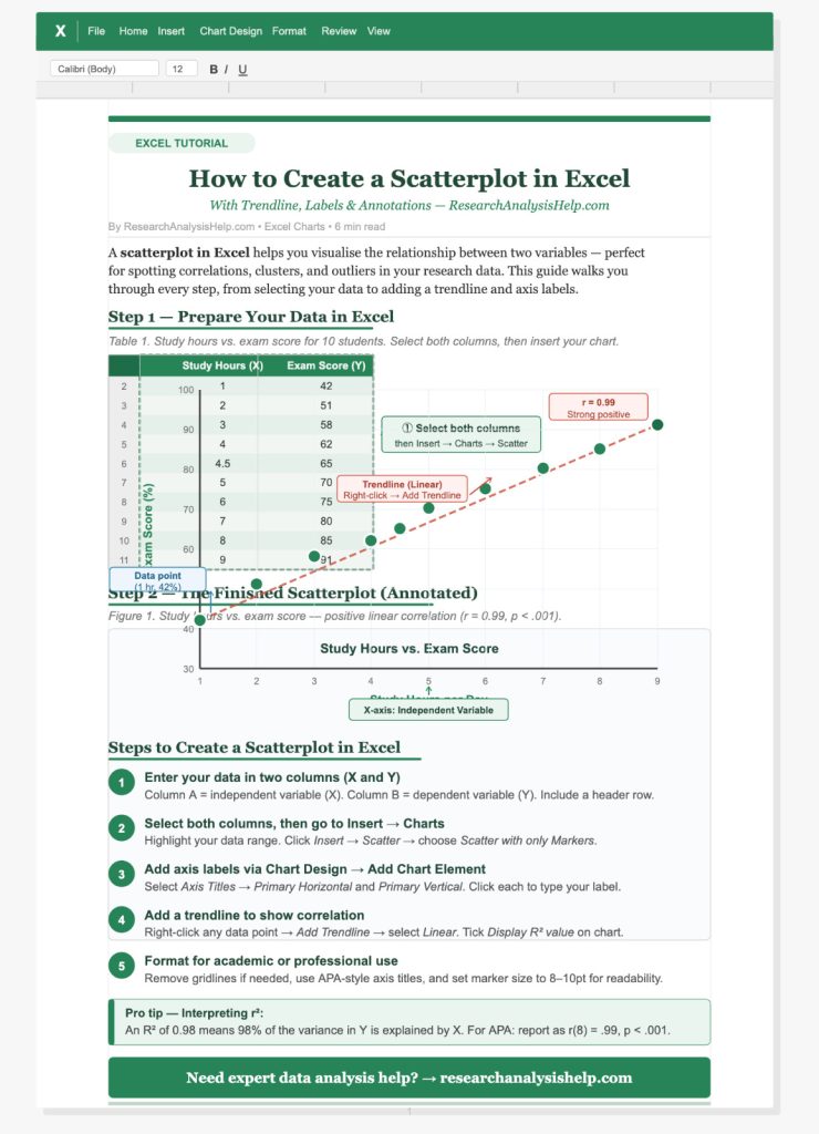
- The first step in creating a scatter plot is to select the data you want to visualize.
How to Create a Scatterplot in Excel: A Step-by-Step Guide
A scatterplot is a powerful tool used in statistical analysis to visualize the relationship between two numeric variables. It displays data points on a graph with one variable plotted along the x-axis and the other along the y-axis. Creating a scatter plot in Microsoft Excel allows you to identify trends, correlations, and patterns in your data. In this tutorial, we will walk you through the process of creating a scatter plot in Excel, from selecting your data to formatting your chart for maximum clarity.
What Is a Scatter Plot?
A scatter plot, also known as an XY chart, is used to graph data points that represent the values of two variables. The horizontal axis (the x-axis) represents the independent variable, while the vertical axis (the y-axis) represents the dependent variable. This type of chart is commonly used to display numerical data and to identify the relationship between two numeric values.
Key Components of a Scatter Plot:
- Data Points: Each point on the scatter plot represents a pair of values from the x and y axes.
- Axes: The x-axis is typically used for the independent variable, while the y-axis shows the dependent variable.
- Axis Titles: Titles for both the horizontal axis and vertical axis provide context for the variables being plotted.
- Chart Title: The title provides an overall description of what the scatter plot represents.
- Legend: The legend may display multiple data series in the case of a scatter plot with multiple series.
Step-by-Step Tutorial on How to Create a Scatter Plot in Excel
Creating a scatter plot in Microsoft Excel is simple and intuitive. Follow the steps below to make a scatter chart from your data.
Step 1: Select Your Data
The first step in creating a scatter plot is to select the data you want to visualize. For a basic scatter plot, you need two columns: one for the x values (independent variable) and another for the y values (dependent variable).
Example:
| X Values (Independent Variable) | Y Values (Dependent Variable) |
|---|---|
| 1 | 5 |
| 2 | 10 |
| 3 | 15 |
| 4 | 20 |
| 5 | 25 |
- Select the data you want to plot, including the headers (e.g., “X Values” and “Y Values”).
- Ensure that the data is laid out in two columns or rows.
Step 2: Insert a Scatter Plot
Once your data is selected, it’s time to create a scatter plot.
- Go to the Insert tab in Microsoft Excel.
- In the Charts group, click on the Scatter button. This will display several scatter chart options.
- Choose the Scatter with only Markers option for a basic XY chart. You can also select other options if you want to include lines connecting the markers.
- The chart will be automatically created, displaying the data points on the graph.
Step 3: Format the Chart and Axes
Add Titles to the Axes
To make your scatter plot clearer, it’s important to add axis titles that describe the variables.
- Click anywhere on the chart area to select the chart.
- Navigate to the Chart Design tab in the ribbon and click on the Add Chart Element dropdown.
- Select Axis Titles, and choose the horizontal axis title for the x-axis and the vertical axis title for the y-axis.
- Enter descriptive titles such as “Time (Months)” for the x-axis and “Sales (Units)” for the y-axis.
Customize the Chart
- Format Data Points: Right-click on a data point in the scatter plot and select Format Data Series. You can change the marker type, color, or size to make the plot more visually appealing.
- Adjust Scaling: If necessary, adjust the scaling options for both the x-axis and y-axis to fit your data. To do this, right-click on the axis, select Format Axis, and adjust the minimum, maximum, and major unit.
- Change the Chart Style: Use the Chart Styles pane on the Chart Design tab to choose a different style or color scheme for your chart.
Step 4: Add a Chart Title and Legend
- Add a Chart Title: To give your scatter plot a meaningful title, click on the Chart Title area at the top of the chart. Enter a title that reflects what the chart represents, such as “Sales Over Time”.
- Add a Legend: If you have multiple data series in your scatter plot, it’s a good idea to add a legend. Click on the chart and then go to the Chart Design tab. Click on Add Chart Element, then choose Legend and select the position that works best for your chart.
Step 5: Modify the Chart as Needed
Scatter Plot with Multiple Series
If you have more than one set of data to plot, Excel makes it easy to add new data series to your scatter plot.
- Right-click on the chart area and select Select Data.
- In the Select Data Source window, click on the Add button under Legend Entries (Series).
- In the Edit Series dialog box, enter the x values and y values for the new series. Click OK when done, and the new data series will appear on the scatter plot.
Remove a Data Series
If you no longer need a data series, you can remove it by going to the Select Data Source window, selecting the series you want to delete, and clicking the Remove button.
Advanced Features for Scatter Plots in Excel
Use a Scatter Plot for Statistical Analysis
A scatter plot is not just a visual tool, it’s also essential for statistical analysis. By looking at the scatter chart, you can:
- Identify trends or relationships between the x and y variables.
- Spot outliers that do not follow the general trend of the data.
- Analyze the linear or non-linear relationship between the variables.
If you need to analyze the data further, Excel also allows you to add a trendline by right-clicking on a data point and selecting Add Trendline. This can help you understand the overall direction of the data.
Format the Chart for Presentation
Once your scatter plot is complete, use the Format tab to adjust the appearance of the chart. You can change the font size, add text labels to specific data points, and modify the outline of the chart area for better presentation in reports or presentations.
Ready to master scatter plots and take your data analysis skills to the next level?
Whether you’re looking to visualize relationships, identify correlations, or format your charts for presentations, Research Analysis Help is here to guide you every step of the way.
Here are some related assignments that could help you further understand and master the use of scatter plots in Excel, along with general data visualization skills:
1. Create a Scatter Plot for a Dataset
- Assignment: Using any dataset you have (such as sales, time, or test scores), create a scatter plot in Excel. Label the x-axis and y-axis, and add a chart title. Analyze the chart to identify any relationships or patterns between the two variables.
- Tools: Microsoft Excel.
- Goal: Learn how to use a scatter plot to visualize the relationship between two numeric variables.
2. Compare Multiple Data Series Using Scatter Plots
- Assignment: Create a scatter plot with multiple series. Choose two or more variables (e.g., sales for different months or years) and plot them on a single scatter plot. Use different markers or colors for each series and add a legend to differentiate them.
- Tools: Microsoft Excel.
- Goal: Practice creating multi-series scatter plots and analyzing multiple relationships simultaneously.
3. Identify Correlations in Data Using Scatter Plots
- Assignment: Take a dataset with two variables (e.g., study hours and test scores) and create a scatter plot. Use the plot to analyze whether there is a positive, negative, or no correlation between the two variables.
- Tools: Microsoft Excel.
- Goal: Learn how to visually detect correlations using scatter plots and trendlines.
4. Visualize Data Trends with Trendlines in Scatter Plots
- Assignment: Create a scatter plot with a dataset that shows a relationship (e.g., time vs. distance, income vs. education). After creating the scatter plot, add a trendline and calculate the R-squared value to understand the strength of the relationship between the variables.
- Tools: Microsoft Excel.
- Goal: Use trendlines in scatter plots to quantify the strength of the relationship between variables.
5. Use Scatter Plots to Detect Outliers
- Assignment: Create a scatter plot for a dataset and manually identify any outliers (data points that fall far from the general trend). Discuss how these outliers may impact the analysis and potential conclusions.
- Tools: Microsoft Excel.
- Goal: Develop skills in identifying and interpreting outliers in your data using scatter plots.
6. Format and Customize Scatter Plots for Presentation
- Assignment: Create a scatter plot and customize its design to make it presentable. Adjust the marker size, colors, axis scaling, and add data labels to each point. Add a chart title, axis titles, and legend to complete the plot.
- Tools: Microsoft Excel.
- Goal: Learn to format scatter plots to enhance their presentation and clarity for reports and presentations.
7. Compare Different Types of Scatter Plot Markers
- Assignment: Create multiple scatter plots with different marker types (e.g., circles, squares, or custom symbols) for the same dataset. Discuss how marker types can influence the readability and interpretation of the data.
- Tools: Microsoft Excel.
- Goal: Experiment with different scatter plot marker types and learn how to choose the best one for clarity.
8. Advanced Scatter Plot Analysis: Multiple Variables
- Assignment: Create a scatter plot with three variables: two plotted on the x and y axes, and the third variable represented by the size or color of the markers. Analyze the additional variable and discuss how it enhances the understanding of the data.
- Tools: Microsoft Excel.
- Goal: Learn how to plot multiple dimensions of data using a scatter plot with multiple variables.
9. Scatter Plot Analysis with Different Scales
- Assignment: Create a scatter plot using two variables but adjust the scaling of the x-axis or y-axis to show logarithmic or percentage changes. Discuss how these adjustments affect the visualization and interpretation of the data.
- Tools: Microsoft Excel.
- Goal: Understand how to use different scaling options in scatter plots to visualize data more effectively.
10. Creating a Scatter Plot for Forecasting
- Assignment: Use a scatter plot to forecast trends based on historical data. For example, use sales data from the past year to forecast sales for the next quarter using the scatter plot and trendline analysis.
- Tools: Microsoft Excel.
- Goal: Learn to use scatter plots as a forecasting tool in business or data analysis.
These assignments are designed to help you master scatter plots in Excel and understand their significance in statistical analysis and data visualization. They’ll provide hands-on experience in creating, customizing, and interpreting scatter plots for a wide variety of applications.
Conclusion
Creating a scatter plot in Microsoft Excel is an easy way to visualize the relationship between two numeric values. By following this step-by-step tutorial, you can efficiently create a scatter plot, customize it with titles, and format it for clarity. Whether you’re using a single data series or a scatter plot with multiple series, Excel provides the tools needed to make your graph both informative and visually appealing.
To learn more about creating scatter plots, data analysis, and other Excel tips, visit ResearchAnalysisHelp.com. We’re here to help you turn your data into insightful visualizations!
FAQs:
How Can I Make a Scatter Plot in Excel?
Creating a scatter plot in Excel is a simple yet powerful way to visualize the relationship between two sets of numeric values. Follow these steps to create a scatter plot:
- Select Your Data: First, open your workbook and select the data you want to plot. Ensure that your data includes two variables: one for the horizontal axis (the x-axis) and one for the value axis (the y-axis). For example, if you want to plot sales against time, the time values will be placed in the x-axis and sales values in the y-axis.
- Insert the Scatter Plot: After selecting the values from the column or row, go to the Insert tab on the Excel ribbon. In the Charts group, click on the Scatter chart option and choose the appropriate scatter type from the available chart options.
- Adjust Chart Elements: Excel will automatically create a scatter plot with your data. You can add labels to both axes and a chart title using the Add Chart Element option under the Chart Design tab.
- Format the Plot: To improve the readability and style of your scatter plot, right-click on individual data points to adjust their appearance. You can change the marker type and size for better visibility.
How Do You Make a Simple Scatter Plot in Excel?
To make a simple scatter plot in Excel:
- Select Your Data: Choose the two columns (or rows) that contain the x values and y values. Ensure the data is properly organized (usually with x values in one column and corresponding y values in the next column).
- Use the Insert Tab: Go to the Insert tab in Excel. Under the Charts group, click on the Scatter button and choose Scatter with only Markers.
- Customize Your Plot: Once the scatter chart is created, you can manually adjust the horizontal axis and value axis labels. Excel also provides the option to add chart elements like a title or data labels for better context.
This is the most basic way to make a scatter plot in Excel—perfect for simple visualizations where you just need to compare two sets of data points.
How to Make a Scatterplot in Excel Using Data?
To make a scatter plot in Excel using data:
- Import or Enter Your Data: If you have your data in a file (such as a CSV or an external source), use the import feature in Excel to bring the data into your workbook. You can also manually enter data by typing the values from column into Excel cells.
- Select Data for Plotting: Highlight the data that you want to use for the scatter plot. Make sure you select both the x values (for the horizontal axis) and the y values (for the value axis).
- Choose Scatter Chart Type: Click on the Insert tab, then select Scatter from the chart options. Choose the scatter plot style you prefer (e.g., markers only, lines, etc.).
- Format Your Chart: Once the plot is created, you can adjust various elements like the axis titles, data labels, and chart title. You may also want to add a trendline to better understand the relationship between the variables.
This method allows you to quickly plot data for visual analysis and identify patterns in numeric values.
How to Make a Scatter Plot Step by Step?
Here’s how to make a scatter plot in Excel, step by step:
- Organize Your Data:
- Ensure that your x values are in one column and your corresponding y values are in the next column or row. This will create a clear coordinate system for plotting the points.
- Select the Data:
- Highlight the values you wish to plot, including both the x values and y values. Excel needs these pairs to correctly plot the points on the graph.
- Insert a Scatter Chart:
- Go to the Insert tab in the ribbon and select the Insert button. From the available chart options, choose the Scatter chart type that best fits your needs. You can also use the dropdown menu to explore more styles.
- Adjust the Axes:
- Excel will automatically create a scatter plot with the horizontal axis of a scatter representing the x values and the vertical axis showing the y values. You can adjust the axis titles and scaling options for better visibility of the data.
- Add Labels and Title:
- After the chart is created, you can add labels to each axis and a chart title by selecting Add Chart Element from the Chart Design tab.
- Finalize Formatting:
- Double-click on the markers in the chart to format them, adjust the size of the markers, and apply color changes for better distinction between different data series if needed.
By following these steps, you’ll have a clean and interactive scatter plot that visualizes your data effectively.
Need more help with creating scatter plots or advanced data analysis in Excel? Contact Research Analysis Help for personalized assistance. Our experts can guide you through Excel scatter chart creation, data analysis, and much more. Let’s turn your data into actionable insights!